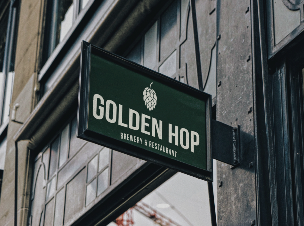
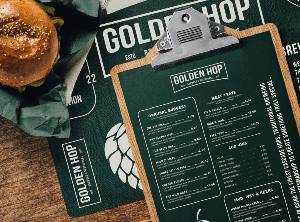
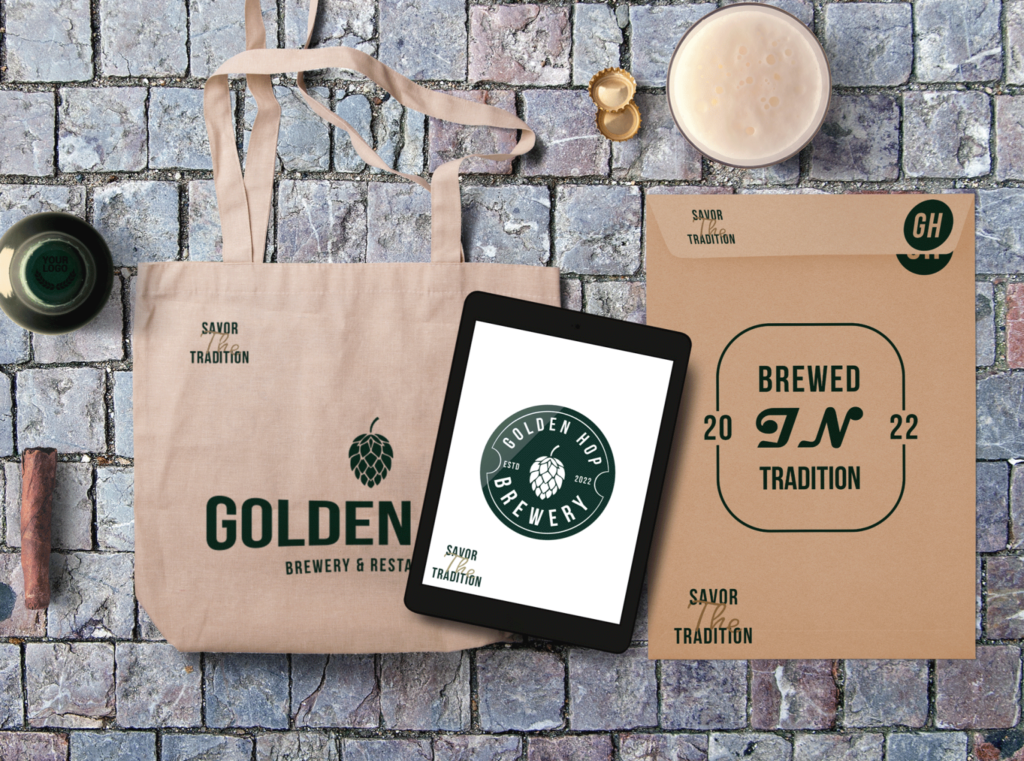
The Golden Hop Brewery and Restaurant is a new local brewery and restaurant concept that aims to create a warm, inviting, and traditional pub atmosphere reminiscent of old local pubs in the UK. With a focus on IPAs made with Cascade hops and a signature lighter, golden-colored beer, the brewery offers a cozy and intimate gathering place for friends and families, combining rich, dark woods and ornamental details.
The Concept
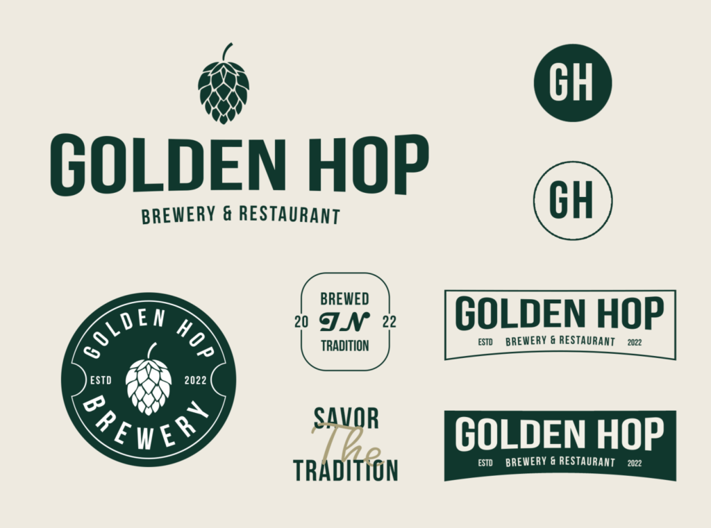
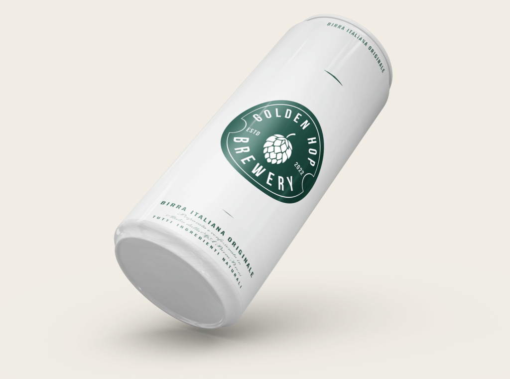
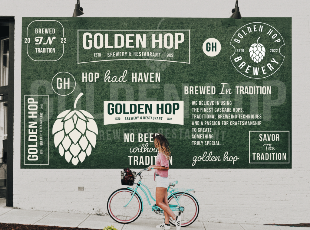
The name “The Golden Hop Brewery and Restaurant” often leads people to believe that their beer is made from the golden hop plant. However, the brewery actually uses Cascade hops, a popular variety known for its distinctive aroma and flavor. To clarify this and reinforce their brand identity, the logo features a mascot representing the Cascade hop, ensuring customers associate the brewery’s exceptional brews with the correct ingredient.
Type & Color
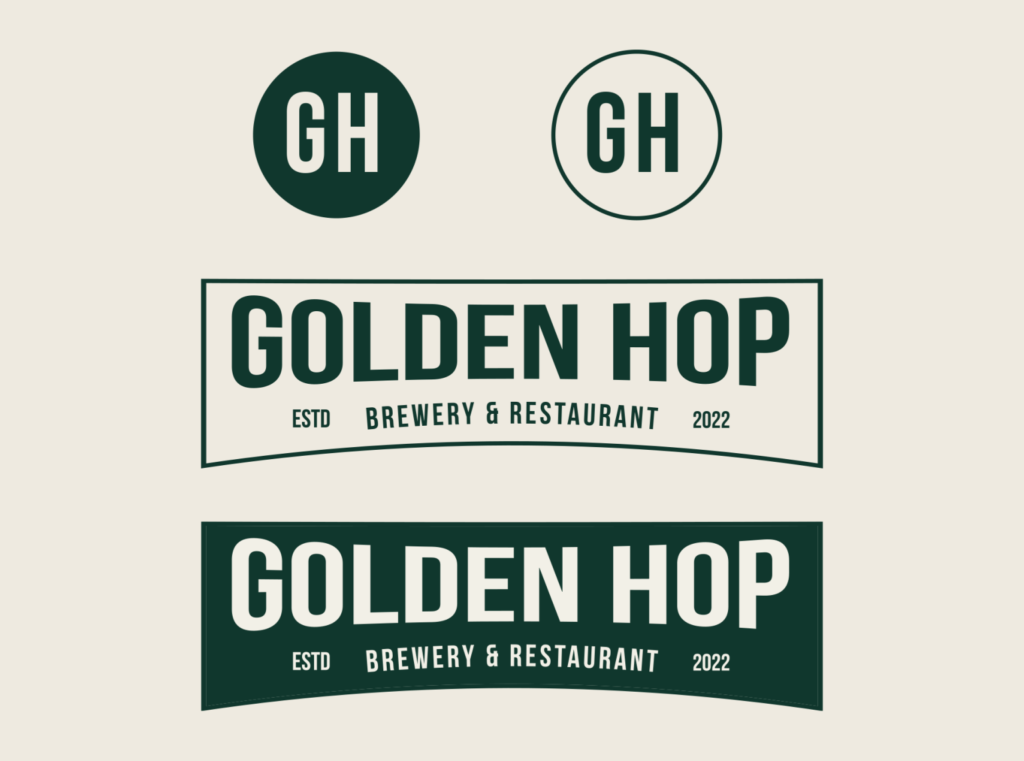
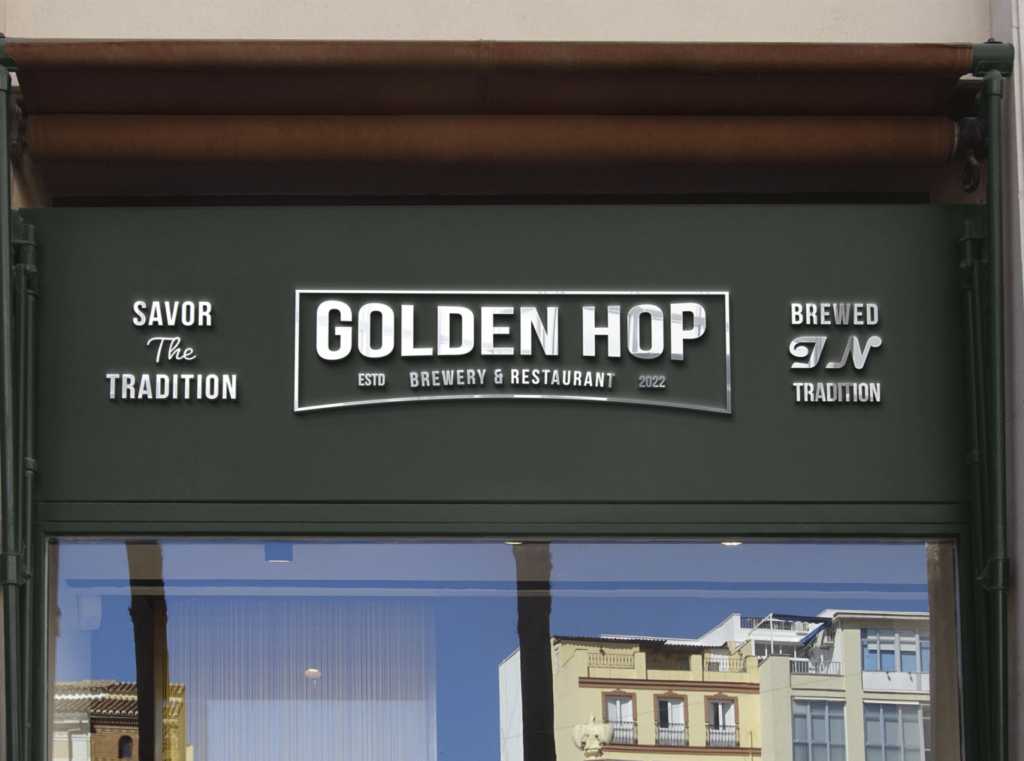
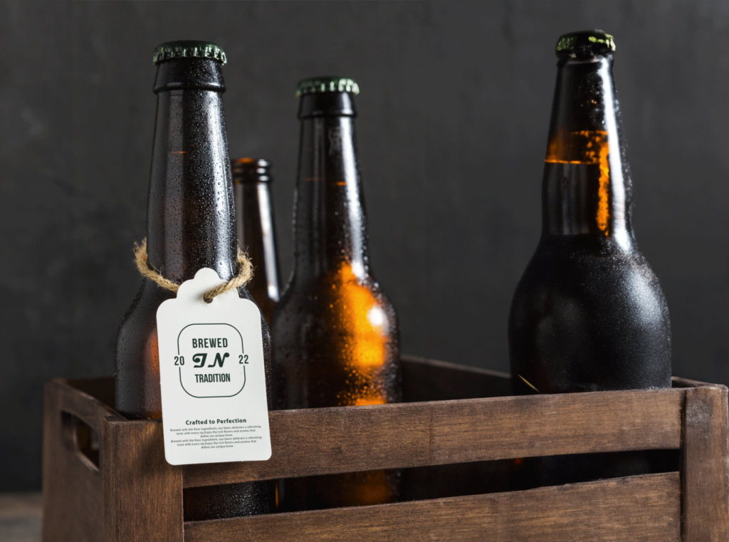
The color palette for Golden Hop features a deep forest green, muted beige, and soft off-white. The deep green exudes tradition and quality, representing the natural elements of brewing. Beige adds warmth and sophistication, complementing the green, while off-white maintains a clean, elegant look, ensuring text and logos stand out.
The bold sans-serif typeface was chosen for its modern yet timeless appeal, conveying reliability and strength. Customized letterforms for the ‘GH’ monogram and ‘Golden Hop’ logotype enhance brand uniqueness. This design blends tradition and innovation, creating a welcoming and polished identity that resonates with customers.